|
|
Post by Mike C on Jan 19, 2014 15:56:42 GMT -8
New regulations coming into effect. These surround the appearance and format of flagship submissions.
Adding text to a flagship photo is completely optional and at the discretion of the contributor. However, if you feel that text would enhance and compliment your submission, we ask that you follow these guidelines. Remember, text should be used to enhance your photo, and should not be the first thing the user sees. Generally, the less text, the better.Text that may be included, if the user feels inclined:Name of ferry Copyright information Location information (only if outlined by the Flagship Conductor or not obvious from photo)
Text that should not be included:Dates Location information (if obvious and not outlined by Flagship Conductor) Other information seen as irrelevant Text Appearance:
Text should be written in white, using a simple, easy-to-read font. If the background is light, or white is otherwise not legible, please use black. Proper spaces and sizing for text on the image:Any of the four corners (copyright information should go on the bottom). Here is an example (text should roughly stay outside of the brown areas): 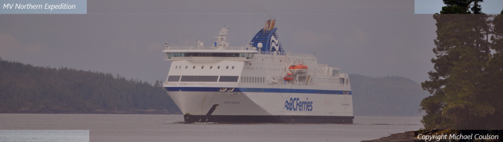 These will come into effect for submissions on February 1st, for the March flagship. If you have any questions, please post here or send me a PM. Thanks for your co-operation! These will come into effect for submissions on February 1st, for the March flagship. If you have any questions, please post here or send me a PM. Thanks for your co-operation!
|
|
Deleted
Deleted Member
Posts: 0
|
Post by Deleted on Jan 19, 2014 18:46:55 GMT -8
What are the consequences for violating these regulations?  |
|
|
|
Post by Mike C on Jan 19, 2014 19:15:56 GMT -8
What are the consequences for violating these regulations? Permanent ban plus you pay my buffet fare for a year. Seriously though, these are just guidelines for the time being. Initially, we will PM the contributor to alert them about the issue with some leniency, and over time we will start disqualifying entries. |
|
|
|
Post by compdude787 on Jan 19, 2014 22:22:34 GMT -8
Just wondering, why don't you want us putting the date on the photo anymore?
|
|
|
|
Post by Mike C on Jan 19, 2014 22:55:31 GMT -8
Just wondering, why don't you want us putting the date on the photo anymore? Because the image is acting as a header for the forum, we want to remove unnecessary text from the image to declutter the homepage. The name of a vessel is seen as essential to understanding a photo, so keeping that is important. The date, however, is not. |
|
|
|
Post by Blue Bus Fan on Jan 20, 2014 19:00:03 GMT -8
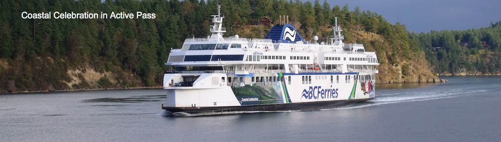
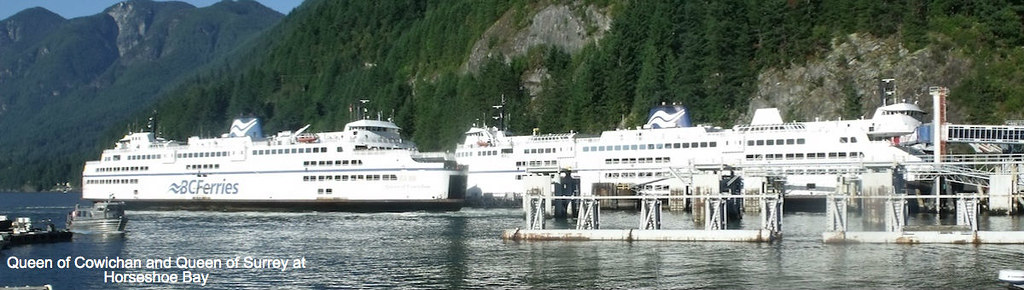
The "new rules" are intended to reduce redundant and unnecessary text. Your first banner includes text to say that the ship is in Active Pass. - that location is obvious to almost anyone looking at the banner. Your second banner (which you say you revised) includes text to say that the ships are in Horseshoe Bay. - again, this location is very obvious to anyone looking at the banner. These 2 are good examples of there being too much text in a flagship banner. - My suggestion: you don't need to include the location. You shouldn't include the location. The new rules suggest that you not include the location. But you included the location, even when it was 2 of the most obvious locations in ferryland, and even when the new rules said to skip the location. Also, the amount of text in the 2nd banner really clutters it up. If you removed the location, it would look better. If I get the change: you want less text in photos or no text at all. So if I had to choose between these two versions of the same photo: 1) 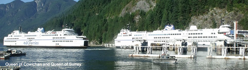 2)  So I would go with number one if the Forum Flagship does not have a location attached to what could be enter? Number two if the Forum Flagship has a location attached to the enter? |
|
|
|
Post by Low Light Mike on Jan 20, 2014 19:18:54 GMT -8
If I get the change: you want less text in photos or no text at all. So if I had to choose between these two versions of the same photo: 1) 2) So I would go with number one if the Forum Flagship does not have a location attached to what could be enter? Number two if the Forum Flagship has a location attached to the enter? Both of these photos have too much text, because they both don't fit into the corners, per Mr. Mileage Photo's first post example in this thread. In my opinion, you don't need any text in either of these photos. |
|
|
|
Post by compdude787 on Jan 20, 2014 20:07:32 GMT -8
If I get the change: you want less text in photos or no text at all. So if I had to choose between these two versions of the same photo: 1) 2) So I would go with number one if the Forum Flagship does not have a location attached to what could be enter? Number two if the Forum Flagship has a location attached to the enter? Both of these photos have too much text, because they both don't fit into the corners, per Mr. Mileage Photo's first post example in this thread. In my opinion, you don't need any text in either of these photos. In that photo, it's not totally obvious what ferry is on the right, since the name is obscured by other things in this photo. Yeah, we know it's a 2nd-generation C-Class, but which one? The Oak Bay or the Surrey? To make it shorter, Blue Bus Fan, you could just say "Queens of Cowichan and Surrey" and/or use a font like Arial Narrow so the label doesn't take up so much space. |
|