|
|
Post by Mike C on Nov 4, 2009 22:46:44 GMT -8
I'm pretty sure there's multiple threads on this... several threads are class- or vessel-specific...
|
|
Nick
Voyager  Chief Engineer - Queen of Richmond
Posts: 2,078 
|
Post by Nick on Nov 4, 2009 22:57:19 GMT -8
Ferryman has done a few threads in the past detailing how to tell certain classes apart, but they were dedicated to a specific class of ship and some of them may have been moved to the archives by now. Search "Identifying the C-class for dummies" and "Identifying the V-class for dummies".
One that hasn't really been talked about before is the Spirit class. There are several ways to tell them apart.
The most obvious, up until last spring, has been the lip between the upper and lower car deck, both at the bow and stern. From the time they were built up to last spring, the SOBC had the lip painted white and the SOVI had it painted blue. That has since been painted on the SOBC to make it blue as well. This is still useful in identifying old photos though.
The next clue, which is obvious when looking at a profile of the ship, is the GPS/Satellite receiver dome just forward of the funnel. The SOVI has 2 close together, where the SOBC only has one.
Another profile clue is behind the mast. On the SOBC, due to a problematic sewage system, there is a black vent pipe (about 4" round) that runs tight behind the mast. The problems plaguing the sewage system were solved on the SOVI before she was completed, so she doesn't have the vent pipe. The vent pipe was installed in the 2007/08 refit season.
The last major difference is at the stern on the sun deck. On the SOVI, there used to be the Lantern Cafe where the Seawest Lounge is currently. There is a single-wide door amidships leading into what is now the Seawest Lounge. This door doesn't exist on the SOBC.
There are various other differences in the decor and lifesaving equipment, but they're fairly minor.
|
|
|
|
Post by Ferryman on Nov 6, 2009 22:33:47 GMT -8
Ah what the heck, I'll do it again for fun. Let's start off with the C-Class. The Cowichan and Coquitlam are the easiest for me to tell the difference from without looking at the name. The biggest difference is the Lower Car deck windows. Most of them are covered up on the Cowichan, however most of them still remain on the Coquitlam. They are highlighted with red in the following photos. The other difference is the type of Elevator Machinery room that is behind the Port side of the #1 end wheelhouse. The Cowichan had hers installed there during her first Mid Life Upgrade in 1996. The Coquitlam never recieved hers until her MLU in 2003. This is highlighted in Blue. Cowichan 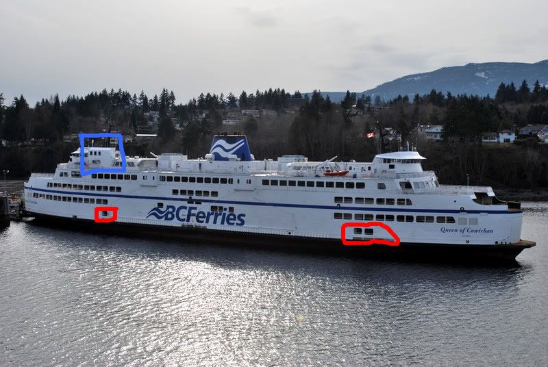 Coquitlam 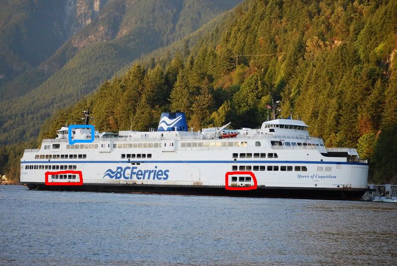 The Oak Bay and Surrey are harder to tell apart from a distance. The only real way I can tell them apart is up close (say, if the name is obstructed when she they are in the dock) That is the fact that the Oak Bay had a random window installed on the port side of the #1 end, and the Port side of the #2 end during her MLU. The Surrey however, never had this window cut out. This is highlighted in red on the following photo. The only other real difference that can be determined in a similar up close, but the name is obstructed situation, is the tint on the Passenger deck windows. The Surrey has always had a blue-ish tint, and am assuming that was a Langdale customization. The Oak Bay always obviously remained the same with no tint. This is roughly highlighted in green. Remember, the blue tint is applied to all of the passenger deck windows. 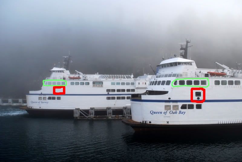 |
|
|
|
Post by lmtengs on Nov 8, 2009 16:04:51 GMT -8
Cool! Thanks, all.
|
|
|
|
Post by Retrovision on Nov 8, 2009 17:55:24 GMT -8
One that hasn't really been talked about before is the Spirit class. There are several ways to tell them apart. The most obvious, up until last spring, has been the lip between the upper and lower car deck, both at the bow and stern. From the time they were built up to last spring, the SOBC had the lip painted white and the SOVI had it painted blue. That has since been painted on the SOBC to make it blue as well. This is still useful in identifying old photos though. ...Had been useful for a relatively short period of time actually. It seems that the SoVI was simply the first of the two to get the blue lips; both the SoVI and the SoBC had had white lips until not too long ago in fact. The closest that I can pin down the SoVI getting her blue lips with my archive is during her winter 2006/2007 refit. Here's a couple pics of mine that I could find from the closest to that period of time that seem to best illustrate the change:  Spirit of Vancouver Island Transiting Active Pass, 29 September 2006 Spirit of Vancouver Island Transiting Active Pass, 29 September 2006 Spirit of Vancouver Island Departing Tsawwassen Terminal, 15 August 2007 Spirit of Vancouver Island Departing Tsawwassen Terminal, 15 August 2007(Although I do have a few other shots that help nail it down closer to her 06/07 refit) |
|
|
|
Post by lmtengs on Nov 8, 2009 19:07:07 GMT -8
Another indicator of telling the Spirits apart is the legend on the hull forward (port and starboard).... Don't forget the obvious difference.. Name on the bow (port and starboard and stern. No need to say the same thing twice in a weekend, buddy    |
|
Nick
Voyager
Chief Engineer - Queen of Richmond
Posts: 2,078
|
Post by Nick on Nov 8, 2009 19:08:13 GMT -8
Hmmm, that is interesting, Retro. I have photos from the mid-90s that show the blue/white difference. Unfortunately, they're film and in boxes...
I had been under the impression that it was a consistent difference up until recently.
|
|
|
|
Post by Retrovision on Nov 8, 2009 21:45:19 GMT -8
Hmmm, that is interesting, Retro. I have photos from the mid-90s that show the blue/white difference. Unfortunately, they're film and in boxes... I had been under the impression that it was a consistent difference up until recently. And here I was under the impression that they had been white lips on both vessels up until the SoVI got hers in 07. I guess they went back to the retro look with the SoVI. |
|
|
|
Post by Ferryman on Nov 9, 2009 10:14:27 GMT -8
Thanks for posting those, Retro. The Spirits have very subtle differences, and are alot harder to tell apart from a distance. I can tell the difference between all three Super C's better than the two Spirits. I'll do the V's now. We'll start off with the Esquimalt/Saanich/New West, who look(ed) most similar. The Esquimalt is the easiest to find, because she had the one odd ball car deck window near the bow, on both the Port and Starboard sides. It was odd because it was just a little bit shorter than the rest of the windows. Another easy indication was the lack of good looking paint on her, since she was somewhat neglected when compared to the other V's. The Saanich was always looking nice and shiny. The Esquimalt was at the point near the end where you could start to see the expo stripes again. Photo is courtesy of Scott Esquimalt 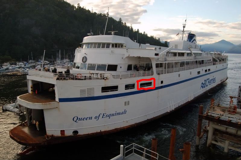 Now here's the Saanich. The Saanich had little decorative curtans around the windows of her lounges, and you could sort of see them from outside of the ship if you were close enough. Flip back and forth between the two pics to see what I mean. 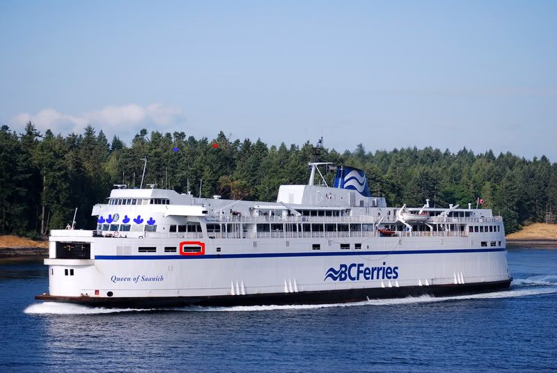 The New West, well is pretty darn easy to see the difference with all of her modifications from her recent facelift(s). Ie: location of evacuation gear, look of funnel, noticable taller upper car deck, and missing cafeteria windows. Someone also mentioned how she has only one window in the center, which is a very recent modification. She used to have three windows along there much like the other V's, but due to placement of evacuation slides, they were covered up. 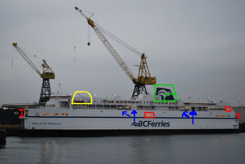 Finally, the Vancouver. If you consider yourself a Ferrygeek, and you can't figure this one out for yourself, then you have some serious studying to do, because this one doesn't get any simpler. Extra windows at the deck 3 (platform deck level), and 3 noticably lower wheelhouse windows are the major differences. She also didn't look as shiny as the Saanich, but not quite as bad as the Esquimalt. 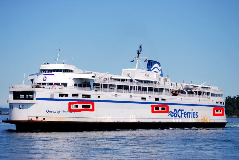 |
|
Deleted
Deleted Member
Posts: 0
|
Post by Deleted on Nov 9, 2009 10:28:56 GMT -8
but now we don't have to figure out v class vessels.Because the the QONW is the only one left that looks close to any v class. other than her extra 9.5 feet and crazy amount of HP.
|
|
|
|
Post by Retrovision on Nov 9, 2009 11:41:38 GMT -8
Thanks for going through the motions again, Ferryman, I'm sure that many here appreciate the refresher course. Finally, the Vancouver. If you consider yourself a Ferrygeek, and you can't figure this one out for yourself, then you have some serious studying to do, because this one doesn't get any simpler. Extra windows at the deck 3 (platform deck level), and 3 noticably lower wheelhouse windows are the major differences. She also didn't look as shiny as the Saanich, but not quite as bad as the Esquimalt. And just to add to that, for those greenhorns who love ferry trivia as most of us here do, we should be reminded of how the Queen of Vancouver got her seemingly experimental forward centre bridge windows while later versions of the design didn't include this aspect (It would be interesting to hear the actual logistical reasoning for why the dropped windows were dropped). As the City of Vancouver - along with sister City of Victoria with both being renamed similar to the original two BC Ferries Sidney and Tsawwassen to include the 'Queen of' prefix around the time that the next two in the class came around ( Queen of Esquimalt and Queen of Saanich) a year after their 1962 construction - she and her sister were the first two in that long line of soon to be proven quite expandable (through stretching and lifting) classic Spaulding-designed single enders that we now know mostly as the 'Victoria' class but were the only ones to include similar bridge windows. |
|
|
|
Post by Curtis on Nov 9, 2009 13:54:14 GMT -8
I'll put in a contribution to this by identifying the "unlifted" of the Sisters Seven. The Queen of Nanaimo and Queen of Burnaby. First from the Port Angle Pointing toward the Stern... Legend: Apologies if this is hard to read for anyone. Highlight it with your mouse/touchpad if it is. Red:[/b] Exclusive... Nanaimo: Car Deck Windows near the Bow and a phone-booth-like shelter at the bow (Deck 4) where the watch stands during the Active Pass transit. Burnaby: Radars above the Wheelhouse are different. Yellow (1):[/b] Behind the Bridge... Nanaimo: The same as the rest of the Vs and Bs Burnaby: Modified into a Solarium During her time on the Seattle-Victoria Route. Blue:[/b] Mast... Nanaimo: All black. Burnaby: White stem and black top. Green:[/b] Mid Ship Deck 5... Nanaimo: Only Ferry of the 7 Sisters that still has her solarium. Burnaby: Enclosed during her time Between Seattle and Victoria. Pink:[/b] Funnel... Nanaimo: Black ring around funnel is thicker. Burnaby: Black ring around funnel is thinner. Orange:[/b] Life Boat Placement Purple:[/b] Evacuation Slide/Chute Placement. Brown:[/b] Liferaft Davits. 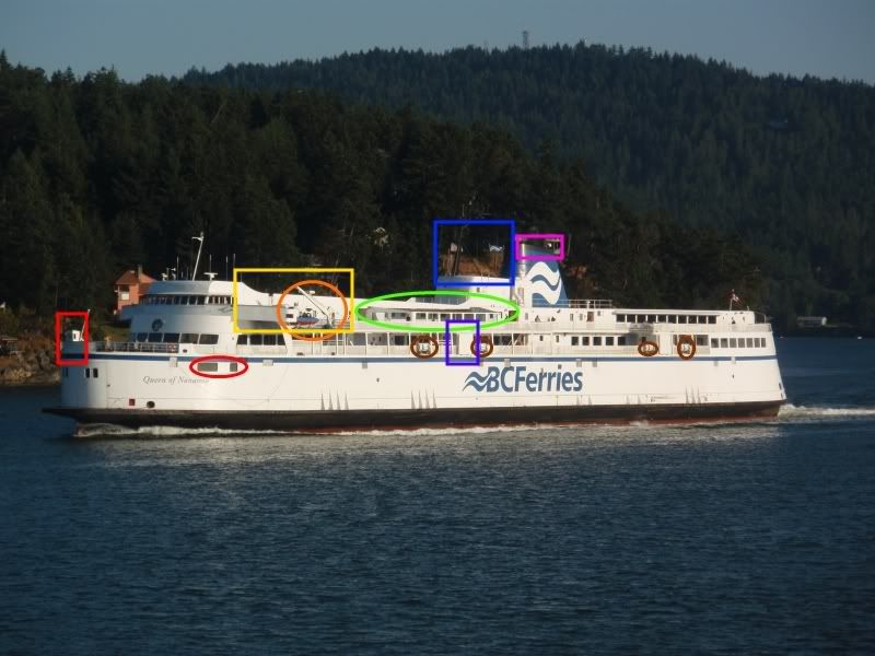 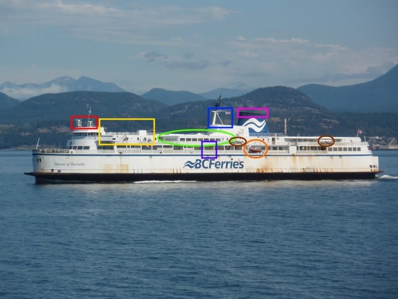 And from Starboard toward the Bow...Ignoring some of the differences from the first two photos. Legend: Again, highlight it with your mouse/touchpad if it's too hard to read. Red:[/b] Exclusive Nanaimo: Cover behind the Deck 5 Stern Lounge. Burnaby: Most of her window (not just the ones shown) appear to have a light tint. (This one is Debatable) Yellow (2):[/b] Stern Doors... (Whether the doors are kept open or closed depends on the route) Nanaimo: Windows on the doors. Also the doors are kept closed unless ferry is docked stern-in. Burnaby: No windows on the doors. Also the doors are left open while underway. (except during stormy weather) Orange:[/b] Life Boat Placement Purple:[/b] Evacuation Slide/Chute Placement. Brown:[/b] Liferaft Davit Placement. 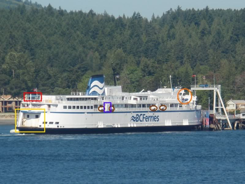  This should cover most if not all of the noticeable differences. |
|
|
|
Post by Scott (Former Account) on Nov 9, 2009 14:18:26 GMT -8
One more point to add to what Curtis has mentioned. The wave graphic on the funnel is another noticeable difference between the Nanaimo and Burnaby...
The Nanaimo's appears to be magnified, similar in appearance to those used on the V's. However, the Burnaby's is formed properly and fits the entire logo completely on the funnel.
|
|
|
|
Post by WettCoast on Nov 9, 2009 23:11:49 GMT -8
 The above photo has been altered. One vessel is the Vancouver and the other is the Saanich. I have obscurred the names, and cloned out the extra car deck windows on the Vancouver. There remains one obvious clue that allows a true geek to distinguish which vessel is which. Over to you. No 'cheating' by looking around on my photobucket site for the answer PS: The Equimalt & Saanich both have these, the Vancouver (& also the Victoria) don't/didn't. |
|
|
|
Post by Ferryman on Nov 9, 2009 23:43:03 GMT -8
The Vancouver is closest. Her "BC Ferries" logo is offset from the center due to the deck 3 platform windows. The opposite vessel obviously being the Saanich, because she has the full "bow banner", as I call it, which is the white banner that is stretched right across the railing in front of the foc'sle. On the Vancouver, the banner only partially covered the railing.
I'm also curious to see what Jim has to say about what the Esq/Saan had, that the Van/Vic didnt...I sure as heck couldn't figure out what it was besides the more obvious points.
|
|
Mirrlees
Voyager
Bathtub!
Deck Engineer- Queen of Richmond
Posts: 1,013
|
Post by Mirrlees on Nov 10, 2009 0:15:08 GMT -8
The Esquimalt and Saanich had ventilators on the roof of the upper deck galley. The Vic and Van did not.
|
|
|
|
Post by WettCoast on Nov 10, 2009 0:29:46 GMT -8
Chris, you have got it right, the Vancouver is closest. But your means of differentiating is not what I was looking for. The difference is toward the stern. The V's, since day 1 could be distinguished from the B's by the funnel arrangement. The Vic & Van could be distinguished from the Esq. & Saanich by the wheel house windows. Once all four V's were stretched, one did not need to be able to clearly see the wheel house windows in order to tell if it was the Vic/ Van or Esq/ Saan. 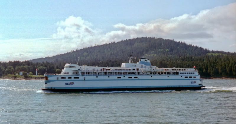 Queen of Vancouver Queen of Vancouver - c1983 DOT photo This could be the Victoria, but definitely not the Esq or Saan. Late add - Mirrlees has nailed it. Lastly, here is the Esquimalt c1982 [DOT photo] 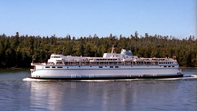 |
|
|
|
Post by Retrovision on Nov 10, 2009 0:55:03 GMT -8
...The Esquimalt was at the point near the end where you could start to see the expo stripes again. From her last time sitting idle at Langdale:  21 April 2008 21 April 2008For a closer look - img33.imageshack.us/img33/5057/p1490595ws.jpg...Try as we might we couldn't get any real access that day, though certainly the terminal manager was only following orders from on high. |
|
|
|
Post by Retrovision on Nov 13, 2009 1:58:40 GMT -8
|
|
Nick
Voyager
Chief Engineer - Queen of Richmond
Posts: 2,078
|
Post by Nick on Nov 13, 2009 7:22:19 GMT -8
I did mention that door in my original post about the Spirits. It was installed on the SOVI originally for access to the Lantern Coffee Bar, which was unique to that ship. The SOBC simply had a lounge there.
|
|
|
|
Post by Kahloke on Nov 13, 2009 9:04:59 GMT -8
I did mention that door in my original post about the Spirits. It was installed on the SOVI originally for access to the Lantern Coffee Bar, which was unique to that ship. The SOBC simply had a lounge there. They must have done that sometime after SOVI entered service, because I took a picture of her in 1995 when there was no door off that lounge, and then again in 1997, after the door was installed. SOVI-1995  SOVI-1997  |
|
Nick
Voyager
Chief Engineer - Queen of Richmond
Posts: 2,078
|
Post by Nick on Nov 13, 2009 9:47:01 GMT -8
I don't think that coffee bar was there originally. I seem to recall my dad wanting to check out "the new coffee shop" on one of our trips to Vancouver. 95-97 sounds to me like it would be about the right time frame for that.
Does anybody know for sure when the Lantern Coffee Bar was installed?
|
|
|
|
Post by Retrovision on Nov 13, 2009 10:42:28 GMT -8
I did mention that door in my original post about the Spirits. Woops, my bad, I forgot about that. Never a bad thing to get some photographic evidence attached I guess though. Speaking of which, thanks, Kahloke, for those before and after images; I seem now to recall the Lantern Cafe being an addition, it's great to see actual images of physical modifications to the exterior. |
|
|
|
Post by Low Light Mike on Oct 22, 2011 17:06:18 GMT -8
Here's a separate thread to chronicle what I think is the best-ever "ID this ship" discussion in our forum's history.
I found the posts in the bottomless-pit of an old historic ferry photo thread which I'm working through for moving the various posts.
So enjoy this thread, and the posts obviously appear before this greeting post, because this is from early 2008.
For full drama, don't read the final answer right away. Follow the various plot twists....
|
|
|
|
Post by WettCoast on Oct 23, 2011 0:30:29 GMT -8
I do not think we ever got to the bottom of this.... If Barnacle could provide a much higher res version of this photo that would allow one to take a good look at the rub rail directly below where it says 'Islands' in the name of the ferry in behind. The Mayne Queen lost its side ramps later in 1975 or early in 1976, but retains its distictive rub rails to this day. We do know that the Bowen Queen served on the Fulford Harbour run for many years. But at what time did she start at Fulford? Some RR Horn photos on Flickr for all to study... farm4.static.flickr.com/3385/3569107128_8b5a1a9c98_o.jpgfarm3.static.flickr.com/2656/3710133160_23f8ba116f_o.jpg |
|