|
|
Post by WettCoast on Feb 15, 2008 11:06:35 GMT -8
I have decided to do a photographic opinionated piece on the BC Ferry fleet, both current and former vessels. I invite everyone to submit your opinions (& photos) which may be very different from mine. This thread takes its inspiration from the thread The top 10 list of beautiful ferries ferriesbc.proboards20.com/index.cgi?board=generaltalk&action=display&thread=1202862875I have decided to rate the ships on a scale of seven stars with 7 being 'drop-dead gorgeous', 4 being 'okay', and 1 being an 'eyesore'. In exceptional cases a zero may be awarded. I am not going to rate the brand new Coast Boats just yet. I need a year or two for them to 'grow' on me. My biases: - My preference for the various BC Ferry paint schemes is reverse chronological. In other words pastel blue is best, expo is alright, the wave scheme (mating slugs) a distant third.
- I generally prefer single enders over double enders; i.e. a ship with a proper bow & stern looks better than ones that are mirror images fore and aft.
To start with I am presenting four C class pictures: 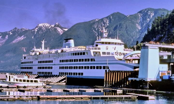 Q of Coquitlam Q of Coquitlam - HSB Terminal - 6 April 1977 - JST photo 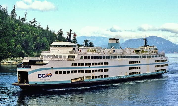 Q of Cowichan Q of Cowichan @ entrance to Horseshoe Bay ~1983 - DOT photo ***** Rated five stars out of a possible seven. The original appearance of the Cowichan & its sister, the Coquitlam, was pretty smart. They are not looking quite so smart today, and they loose one, maybe two stars. This is due to modifications that have been made, including the asymmetrical car deck windows, and the current paint scheme. 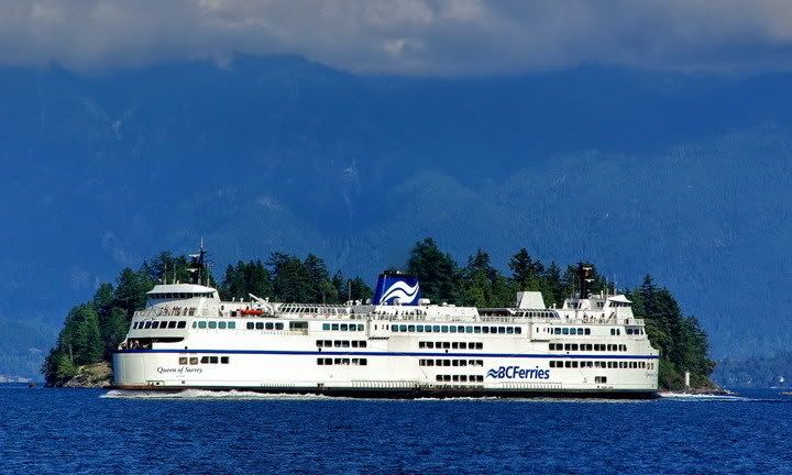 Q of Surrey Q of Surrey just off of Langdale Terminal - Aug 2007 - JST photo **** Rated four stars out of a possible seven. The Surrey, and its sister the Oak Bay have, IMHO, a superstructure extending too far toward the ends of the ship. This makes for more spacious passenger lounges, but detracts from their appearance relative to the earlier C class. 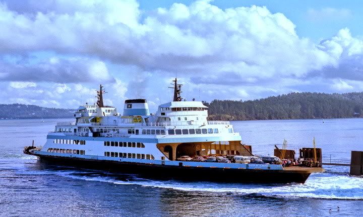 Queen of Alberni Queen of Alberni arriving at Swartz Bay - c1979 - DOT photo ***** Rated five stars out of a possible seven. Rating today would be three stars, as upper car deck, superstructure mods and current livery have detracted in a significant way from the appearance of the Alberni. I have decided that, in gereral, the fleet is a fair to good looking one. More to come later.... |
|
Mill Bay
Voyager  Long Suffering Bosun
Posts: 2,886 
|
Post by Mill Bay on Feb 15, 2008 11:46:01 GMT -8
Wet Coast Kid, I agree with you all the way!!
Your appraisal of the paint schemes is dead on, and this is a great appreciation of the C-Class ships, especially with the Oak Bay and Surrey having an over-extended superstructure. I've thought that too, because it just makes the upper car deck openings look weird, like some maniacal buck-toothed grinning face.
As for the Alberni, I really like the original design of her as well. She did look pretty good after she was lifted as well, until they started making all the weird modifications to her for Duke Point service.
I just had a wild thought, though... with regards to the original Alberni design, I think they should have used it as the basis for the design of these new intermediate vessels instead of the ugly Island Sky. Maybe a bit scaled down, with a central bridge, but wouldn't it be neat to see a few mini-Queens of Alberni sailing around some of the intermediate routes?
|
|
|
|
Post by WettCoast on Feb 15, 2008 15:14:29 GMT -8
I just had a wild thought, though... with regards to the original Alberni design, I think they should have used it as the basis for the design of these new intermediate vessels instead of the ugly Island Sky. Maybe a bit scaled down, with a central bridge, but wouldn't it be neat to see a few mini-Queens of Alberni sailing around some of the intermediate routes? A scaled down Q of Alberni (as originally built) type of design with a central bridge would be a good design, I think, for both 'intermediate-type' applications, and possibly as a B class replacement. A main car deck capacity of ~130, with provision for mezzanine decks carrying ~50, seems about right to me. The design could be tweaked for open straight crossings to include a fully enclosed car deck, unlike the original Alberni. |
|
|
|
Post by Mike C on Feb 15, 2008 19:31:51 GMT -8
I've never thought the mating slug scheme has been particularly appealing. The pastel blue scheme, kind of that retro look, has come back into style. If you look at this photo of a Translink bus, you can see the resemblance - the soft curve at the bow, sweeps up along the sides. On the bus, however, the sweep comes along the sides to form a "C" on the side. 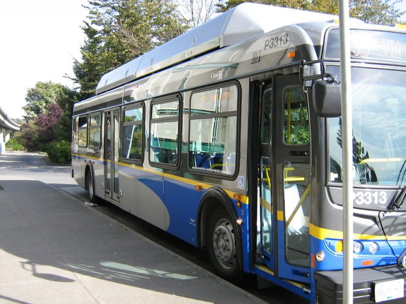 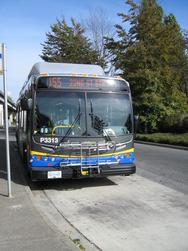 I personally think that it has potential, especially on ferries, to bring back a retro, but modern look that would provide a look into the past of the BC Ferry Service. And now, for the pictures... U-G-L-Y, You ain't got no alibi...  All these beautiful girls.... All these beautiful girls....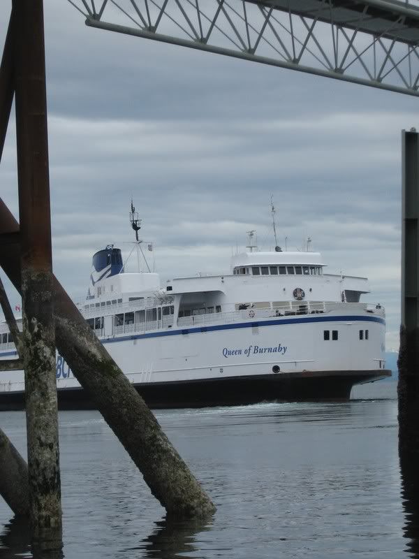  |
|
|
|
Post by Ferryman on Feb 16, 2008 18:48:37 GMT -8
Queens of Cowichan/Coquitlam. These two ships look good, but I think the design was used too many times, especially seeming some of Washtington State Ferries had the first design. So this is more of a copycat version, with an extra car deck. But I can tolerate it regardless. *****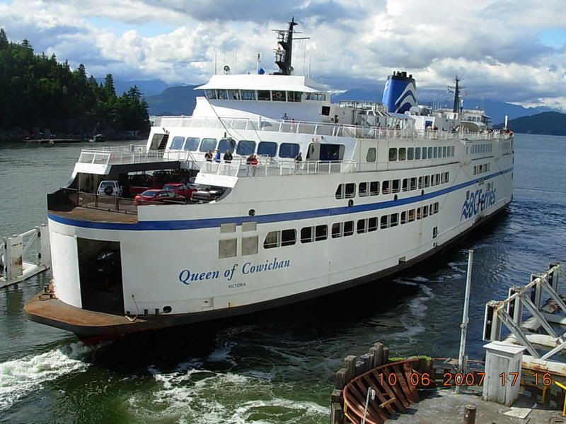 Queens of Surrey/Oak Bay. These two have been my favourite for years, for their extra passenger space. I've never liked the overly exposed upper car deck of the Cowichan and Coquitlam. ******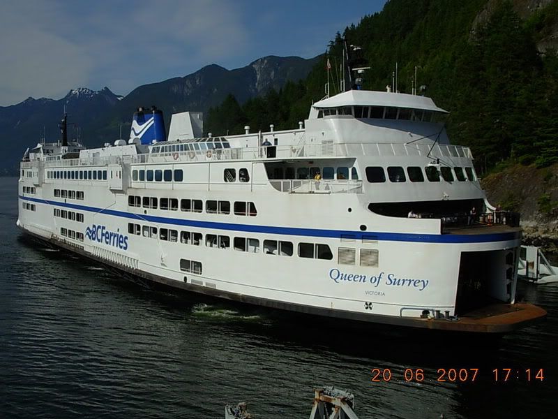 The open deck vessels have never been really appealing to me. Especially the "K" Barges. The wheelhouse being set to the side of the vessel has always been a bad feature in my opinion. ** Even though these vessels are sort of "barge like", the unique superstructure compensates for that. This only applies to the Bowen/Mayne Queens though. ***** The Spirits have always been touch and go for me. Sometimes I don't mind them, sometimes I'd rather be looking at its predecessors, the V-Class. The bridge is usually the first thing that catches my eye, with how long it is. Very European like I think. These ships seem quite boxy as well, with how wide they are. ****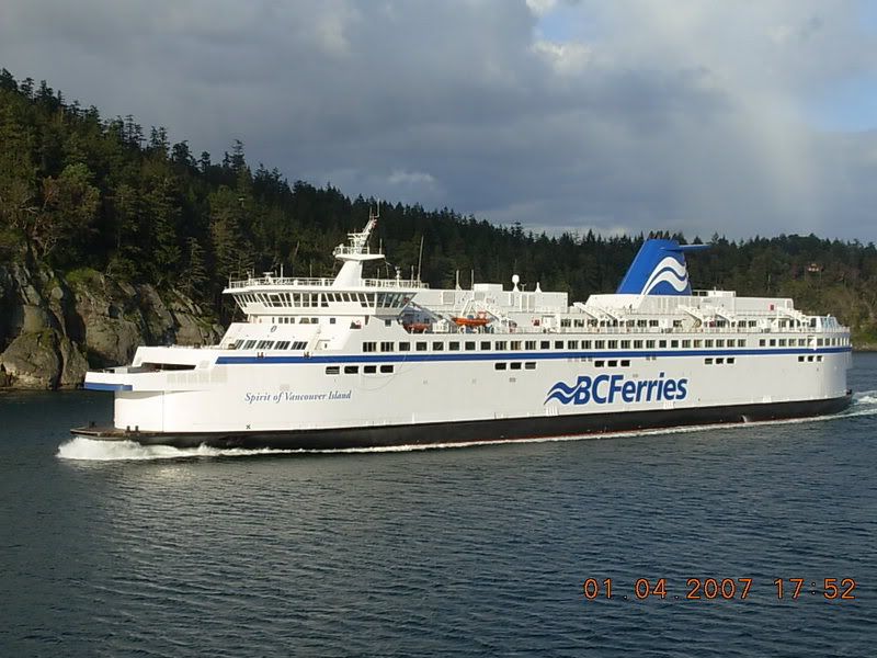 Boxy Beast! Everywhere you look, you find something that resembles a square. This one reminds me of a stereotypical amateur drawing of a ferry, with it lacking any real design feats. *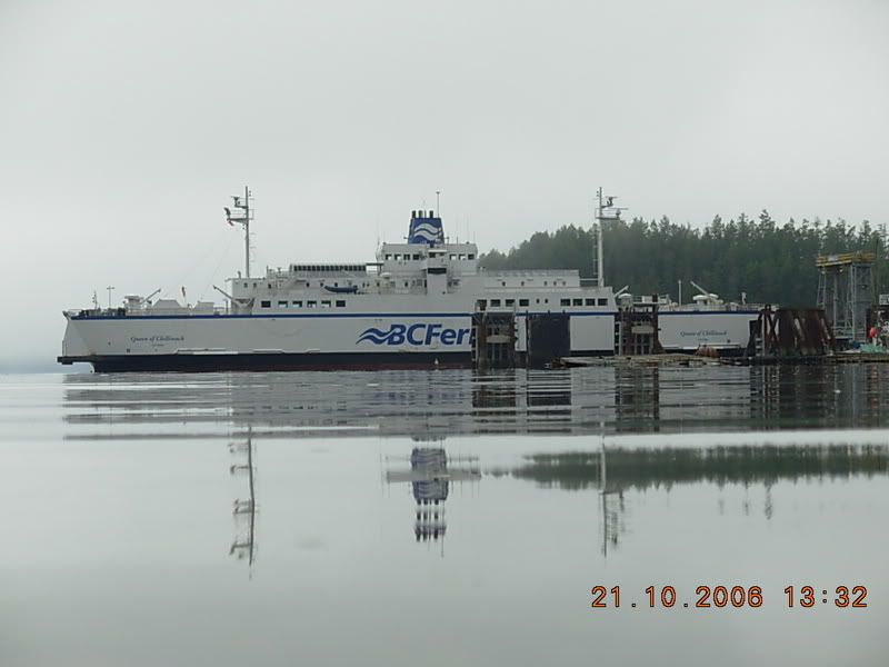 Final photo for now. She's at least 80% original still, and if it wasn't for her and her sisters design (Coho too!), we would have a fleet of Queen of Chilliwacks and Northern Adventures. The recent modification of the windows in the forward lounge, and rest of the windows along the promenade deck, bring her rating down a bit. But she's still a classic nonetheless. ***** 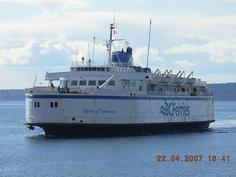 |
|
|
|
Post by DENelson83 on Feb 16, 2008 19:00:13 GMT -8
Hmmm... I wonder if any of the C-class vessels have ever had the BC coat of arms plaques on their ends?
|
|
|
|
Post by Low Light Mike on Feb 16, 2008 19:06:59 GMT -8
I'm in an 80's TV smart-ass mood tonight.  But is Vincent the "beauty" or the "beast"? |
|
Quatchi
Voyager
Engineering Officer - CCG
Posts: 930
|
Post by Quatchi on Feb 16, 2008 21:05:18 GMT -8
I'm not going to say anything about the Chilliwack, but I agree with West Coast Kid. Barges are blah, double enders are ok, and single ender V's are the best. What do you think of the Kalakala? Personally I think a solid 1 star, she looks like a floating blender. www.evergreenfleet.com/kalakala.htmlCheers, |
|
|
|
Post by WettCoast on Feb 16, 2008 21:41:21 GMT -8
Tonight I rate the Spaulding designs from the Sidney on down to the lifted V's... The rating system, biases, etc., are as above.Q of Sidney entering Westview Terminal [Powell River] - Aug 1993 (JST photo) 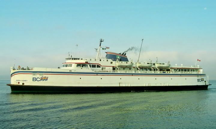 ***** ***** Rated five stars out of a possible seven. The Sidney and her sister, the Tsawwassen, were nice to look at in 1960, and are still nice to look at 48 years later. Q of Nanaimo (~~) c late 1960's entering HSB - postcard - DOT collection  ***** ***** The V/B class as originally built were virtually identical and looked fine. Stretching improved them to a six star rating. Q of Esquimalt in Active Pass - ~ late 1970's - DOT photo 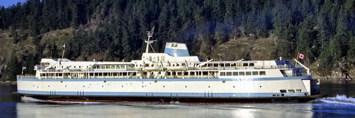 Queen of Vancouver Queen of Vancouver - 1970's - Route 1 - from Beaut. BC Mag (DOT collection) 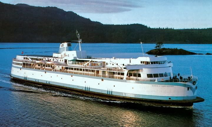 ****** ****** Rated six stars out of a possible seven. The V's & B's were at their finest post stretching, but before lifting, and while still wearing pastel blue. Q of Vancouver backing out of Tsawwassen Terminal c 1981 - DOT photo 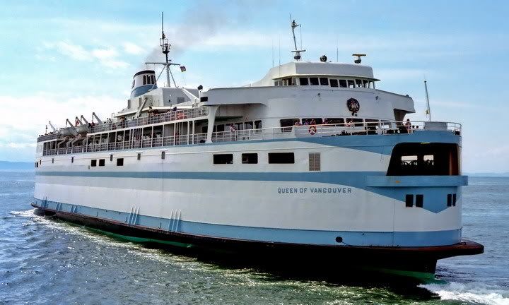 ***** ***** Rated five stars out of a possible seven. The Vancouver is looking great here. She and her V class twins (the Victoria, Esquimalt & Saanich) were still looking good in pastel blue post lifting. Nevertheless, the lifting detracted somewhat from their sleek looks and so one star was lost. Q of Nanaimo en route to Tsawwassen - Mt Baker in background - Aug 2007 (BGT photo)  ***** ***** Rated five stars out of a possible seven. The Nanaimo is still looking pretty good here in the summer of 2007, some forty plus years into her life. I'd have given her six stars if not for the uninspired dark blue and white livery she currently sports.
|
|
|
|
Post by Northern Exploration on Feb 17, 2008 7:28:52 GMT -8
I agreed with all your ratings - good job with the pics as well. I too thought the stretched/pre-lifted V's looked the best. The Tswwassen and Sidney had the extended fore deck that I enjoyed on warm sunny days. The raised forward lounge meant you could also lean against the deckhouse in the sun and still be under the windows and not worry about blocking anyone's view who were seated in the forward lounge.
|
|
|
|
Post by WettCoast on Feb 18, 2008 19:50:07 GMT -8
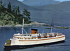
Tonight I am appraising a few of the BCF retired/gone fleet...Langdale Queen ( Kaloke) in Howe Sound ~1975 - DOT photo 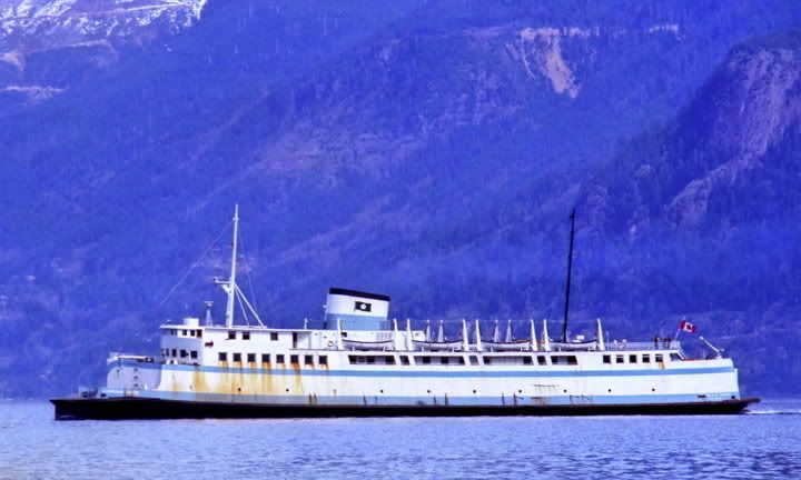 *** *** Three out of a possible seven stars. This photo was taken not long before the LQ was retired. Obviously some paint was needed. In its prime the Kaloke / Langdale Q would have scored at least four stars. Sechelt Queen ( Chinook) off of Horseshoe Bay - Sept 1972 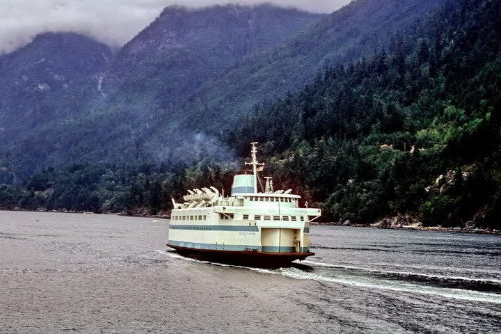 **** **** Four out of a possible seven stars. The Chinook was a real 'looker' in its day, and was worthy of six stars. But after they cut off her bow it was all down hill. At the end of her BC career, when she was under the BC MoHwys colours (white and yellow), more windows had been covered up, and life boats stripped, she rated only three stars. Treasure the photos of her from when she wore red and white and operated in Puget Sound and Juan de Fuca Strait. Sunshine Coast Queen in Howe Sound - ~1975 [DOT photo] 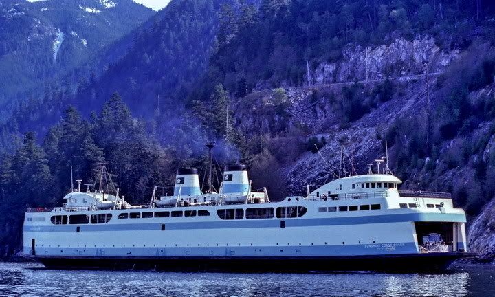 ***** ***** Five out of a possible seven stars. I have always liked the appearance of BCF's first big double ender. Unfortunately I never had the experience of traveling on her. This photo was taken not long before her retirement. In spite of that it shows that her appearance was being kept up, and contrasts with the sorry state of the Q of Esquimalt today (2008). Q of the Islands @ Earls Cove, Sunshine Coast - July 1978 - JST photo 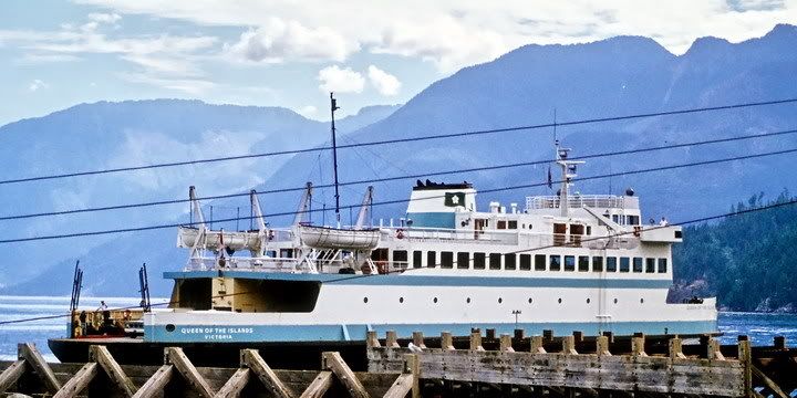 ***** ***** Five out of a possible seven stars. Operationally the QotIslands turned out to be a bit of a flop. Appearance wise, however, she was not bad. She gets points for having a stern that is distinguishable from her bow. The pastel blue livery also looks good on her. Also one of the better looking smaller boats to have ever served in the Dogwood Fleet. M/V Pender Queen ( Motor Princess) near Nanaimo - DOT collection - Sept 1971 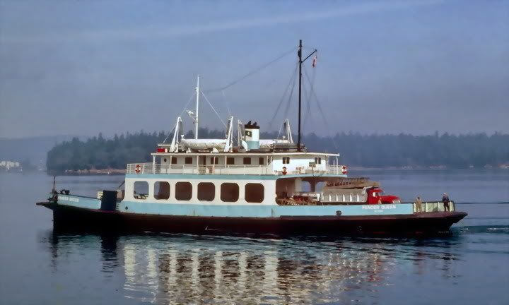 ****** ****** Six out of a possible seven stars. The PQ/MP was a darling among the little ferries. I think she looks better than any of the little ferries in the fleet today. Must be those car deck windows or the gentle curvature of the hull. My brother tells me that the wheelhouse was quite something. It had a six foot diameter steering wheel like something you might have expected to find on a pre-1920's stern wheeler. More later....
|
|
Mill Bay
Voyager
Long Suffering Bosun
Posts: 2,886
|
Post by Mill Bay on Feb 19, 2008 8:36:36 GMT -8
Tonight I am appraising a few of the BCF retired/gone fleet...Langdale Queen ( Kaloke) in Howe Sound ~1975 - DOT photo *** Three out of a possible seven stars. This photo was taken not long before the LQ was retired. Obviously some paint was needed. In its prime the Kaloke / Langdale Q would have scored at least four stars. The Langdale Queen is at least worth more than three stars. There's been mention about the Chinook as being the basis for a whole generation of steamship-styled ferries, but don't forget to include the Langdale Queen in this group. Her rebuild came after the Chinook's construction, and there was clearly a similar design philosophy in mind with the superstructure. With the slope of the deck, rakish superstructure and that tall, stately funnel, this ship clearly tries to evoke the old days of steam. I only wish that they might have done something a little more stream-lined with the bow doors. She's at least five stars or above. |
|
|
|
Post by Barnacle on Feb 28, 2008 8:00:59 GMT -8
The slope of the deck and the rakish superstructure don't try to evoke the days of steam; they're a result of the hull being from the days of steam. Remember, that's a 1903-vintage hull under there, and it was originally a passnger vessel.
Lovely boat, though. ;D
|
|
|
|
Post by WettCoast on Feb 28, 2008 21:25:32 GMT -8
Tonight I'm featuring six of the smaller vessels still operating in the fleet. I am going to go from ferries that I think are homely to ones that I really have a soft spot for.... Howe Sound Queen in Howe Sound on Bowen run, ~1975 [DOT photo]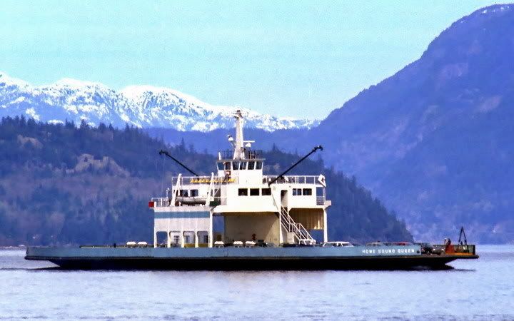 ** ** Rated two stars out of a possible seven. The Hound Dog is the 'pain Jane' of the smaller vessels in the fleet. Perhaps she might get three stars as she appears today. I think they have made a few improvements since this photo was taken 30+ years ago. North Island Princess - between Kelsey Bay & Beaver cove - May 1978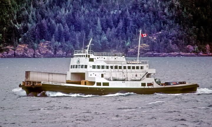 *** *** Rated three stars out of a possible seven. I might have been more charitable and given her four stars but in this view she is wearing BC Hwys dept drab black & white, which is perhaps even worse than the current slug-waves. Skeena Queen en route to Fulford Harbour, Salt Spring - Nov 2007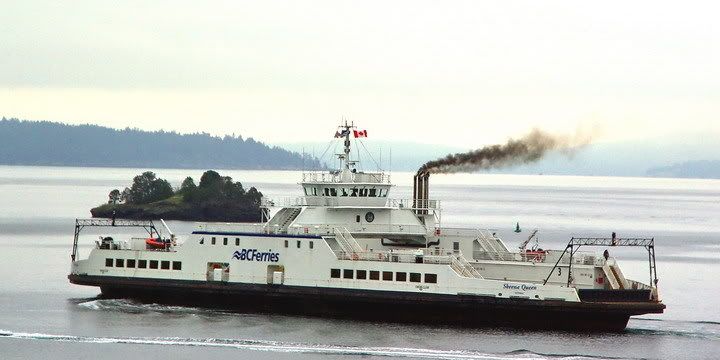 *** *** Rated three stars out of a possible seven. She's an almost symmetrical barge that operates in a very pretty corner of the universe. I do like this view of her 'smoking it up' like an old steamer. Queen of Capilano - Howe Sound near HSB - Aug 2007 **** **** Rated four stars out of a possible seven. She's double ended and boxy but looks great in this splendid setting in Howe Sound at the entrance to Horseshoe Bay. Bowen or Mayne Queen @ Swartz Bay - ~1986 - DOT photo ***** ***** Rated five stars out of a possible seven. The Bowen & Mayne Queens are the nicest of the smaller double enders. I think that it is the 'wedding cake' appearance of their superstructures that I like. Their one time sister (the Powell River Queen) had some serious plastic surgery that marred her appearance such that four stars might me over doing it. Tenaka off of Rebecca Spit - Quadra Island - Aug 2007 ****** ****** Rated six stars out of a possible seven. This is my favourite of all the small ferries. She's single ended & looks neat. I wish I had a bathtub toy just like her. |
|
Mill Bay
Voyager
Long Suffering Bosun
Posts: 2,886
|
Post by Mill Bay on Feb 29, 2008 9:14:13 GMT -8
Interesting assessments Wet Coast Kid.
But I think you could have given the Howe Sound Queen and the NIP a couple more stars each. They both look better in those pictures, with those older schemes than they do today.
But your choice of the Tenaka as the most beautiful is absolutely correct. If anything in the fleet still inspires the old steamships, this one does.
I don't mind the North Island Princess in the highways scheme, but for me, it seems that it's more the angle you're viewing her from that makes her look attractive or not. From certain perspectives she is, from others, she isn't (much like the Coastals).
As for the Skeena Queen, she might even need to lose a star.
I was just wondering how you might rate the HSQ in her original configuration though.
|
|
|
|
Post by WettCoast on Feb 29, 2008 18:42:14 GMT -8
Interesting assessments Wet Coast Kid. But I think you could have given the Howe Sound Queen and the NIP a couple more stars each. They both look better in those pictures, with those older schemes than they do today. But your choice of the Tenaka as the most beautiful is absolutely correct. If anything in the fleet still inspires the old steamships, this one does. I don't mind the North Island Princess in the highways scheme, but for me, it seems that it's more the angle you're viewing her from that makes her look attractive or not. From certain perspectives she is, from others, she isn't (much like the Coastals). As for the Skeena Queen, she might even need to lose a star. I was just wondering how you might rate the HSQ in her original configuration though. On the whole, Mr Mill Bay, I have to agree with you on most of what you have said. The NIP could be rated a star or even two higher. With the right paint scheme in the right setting you could argue that she looks as good, maybe better, than say a Cap-Cum class boat. As for the Hound Dog, I've always thought she looks ramshackle, kind of like big brother to the MV Mill Bay ;D. Initially she had less of a superstructure. I need to see pictures & have a good look to see what I think. I am hard pressed to be charitable and give her more than the two stars already awarded. Here is another more recent view at Vesuvius terminal from March 2005 (JST photo) ...  I would say that three stars is pushing it. I invite others to submit a nice photo of the HSQ and explain why they think she should rate five stars. I will next feature the northern boats from the Kwuna on up the the QotN. I bet you can't guess which one will get seven stars and which one only one... |
|
|
|
Post by Curtis on Feb 29, 2008 18:56:03 GMT -8
I guess it's time for me to put my Two Cents into this. My Ratings are Out of 6. My Category for this Post. The Main Ships Serving the Sunshine Coast. They Rate Quite High. North Island Princess: ****  4 Out of 6 Stars. BC Ferries' Only Catamaran Rates Fairly High The Design Loses Points in Some Places Due to Her 1971 Facelift. Queen of Burnaby: *****  5 Out of 6 Stars. The 7th of the Seven Sisters. One of the Best Ship Designs in History. However She Loses Points in Places from her 1994/97 Refits and Her Coastalization. Queen of Capilano: ******  6 Out of 6 Stars. Despite Being the Mechanical Nightmare She is. The Queen of Capilano Boasts one of the Best Designs Among Smaller Vessels of the BC Ferries Fleet. Not much else can be said. Queen of Chilliwack: **  2 Out of 6 Stars. Maybe I'm Being a Little Generous to BC Ferries' Box of Wonder. But Trust Me, Ships Way Worse Have Been Designed. Queen of Surrey: ******  6 Out of 6 Stars. Another of Spaulding's Great Designs, the Surrey is probably the best looking "C" Class Interior and Exterior Wise. Queen of Tsawwassen:*****  5 Out of 6 Stars. Losing a Higher Star Rating beacuse of Those Boxy Fire Windows, The 2nd of the Two Original BC Ferries is still Good Looking After 48 Years of Reliable Service. That's All For Now... |
|
|
|
Post by WettCoast on Feb 29, 2008 23:08:20 GMT -8
I said I will do the northern boats, but before doing so, I must not forget the Spirits... Passing Spirits - Active Pass - May 2007 Spirit of BC approaching Swartz Bay - May 1995 Spirit of BC approaching Swartz Bay - May 1995 West Coast Mariner - back cover - Sept 1992 (DOT collection) West Coast Mariner - back cover - Sept 1992 (DOT collection) SoVI - Active Pass - June 2001 SoVI - Active Pass - June 2001 SoVI in Active Pass - bound for Tsawwassen - May 2007 SoVI in Active Pass - bound for Tsawwassen - May 2007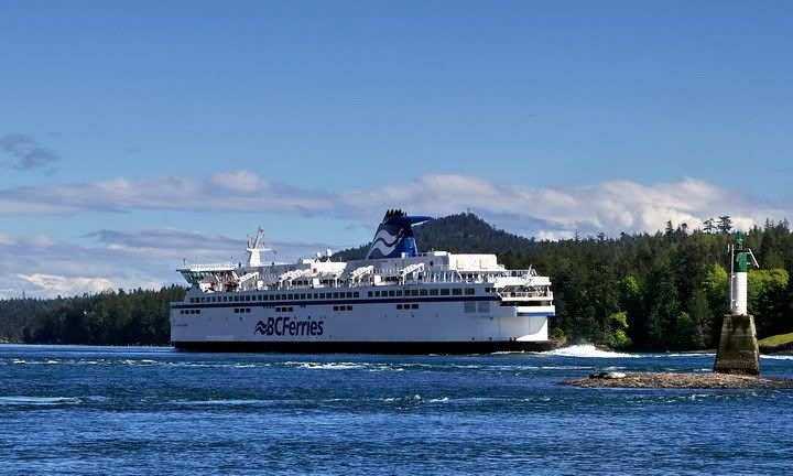 ***** ***** Five out of a possible seven stars. The Super V's are actually lifted V's on steroids. They would look better if they were sleeker - i.e. less bulked up. These boats actually don't look that bad in the wave-slug scheme when compared to the original modified Expo scheme. I think that they would have looked much better if they had been done up as in the artist's impression from the West Coast Mariner above, or better yet, in the original pastel blue scheme. These are comfortable, spacious and well designed boats that operate in some darn fine geography. Appearance wise they are alright. |
|
|
|
Post by Mike C on Mar 1, 2008 21:22:59 GMT -8
Alright, I know what you're thinking: "That damned NewFlyer idiot has already rated ferries! I wish he would just stay off of this thread!" Well, out of a slight technicality I have not already rated ferries. I did not rate them because I didn't use the valid star system. so haw-haw. eat my posts.  QUEEN OF CAPILANO. QUEEN OF CAPILANO. *****/7. Looks awesome... it's lack of platform decks and it's inability to work properly deducts two stars.  QUEEN OF VANCOUVER. QUEEN OF VANCOUVER. *****/7. Agreeing with Jim, the ferries looked best stretched, but not lifted. A single ended classic, I'll rate it purely with sympathy. 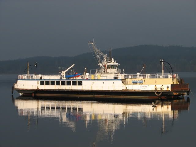 KAHLOKE KAHLOKE **/7. A crappy barge... perhaps I'm being too generous. This thing belongs behind a tugboat at Seaspan. 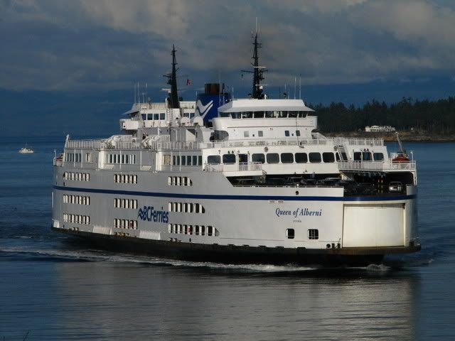 QUEEN OF ALBERNI QUEEN OF ALBERNI ***/7. Poorly designed after lifting, blocked-off pickle-forks and lack of passenger interior space give this puppy a failing grade.  TENAKA TENAKA *******/7. 'Nuff said?  QUEEN OF COWICHAN QUEEN OF COWICHAN ****/7. Not a lot to be said really; this was a pretty generic design for a boat. Deducted points for its lack of originality. |
|
|
|
Post by DENelson83 on Mar 1, 2008 22:44:00 GMT -8
Gimme more chances to ride the ferries and maybe I'll give you some ratings.
|
|
|
|
Post by Kahloke on Mar 2, 2008 10:58:49 GMT -8
QUEEN OF COWICHAN ****/7. Not a lot to be said really; this was a pretty generic design for a boat. Deducted points for its lack of originality. I think I would agree with you based on how Cowichan looks today, but I would have given this boat a higher rating for her original design. She looked a lot better before all the modifications. |
|
Mill Bay
Voyager
Long Suffering Bosun
Posts: 2,886
|
Post by Mill Bay on Mar 4, 2008 9:26:51 GMT -8
QUEEN OF COWICHAN ****/7. Not a lot to be said really; this was a pretty generic design for a boat. Deducted points for its lack of originality. I think I would agree with you based on how Cowichan looks today, but I would have given this boat a higher rating for her original design. She looked a lot better before all the modifications. Original or not, the Cowichan and Coquitlam still look better than their blunt-nosed sisters. |
|
|
|
Post by WettCoast on Mar 4, 2008 18:14:38 GMT -8
Original or not, the Cowichan and Coquitlam still look better than their blunt-nosed sisters. I agree with you, Mr. Mill Bay, 100% on that. I also like your description "blunt-nosed sisters". |
|
Mirrlees
Voyager
Bathtub!
Deck Engineer- Queen of Richmond
Posts: 1,013
|
Post by Mirrlees on Mar 4, 2008 23:32:41 GMT -8
Original or not, the Cowichan and Coquitlam still look better than their blunt-nosed sisters. I agree with you, Mr. Mill Bay, 100% on that. I also like your description "blunt-nosed sisters". Make that "blunt-nosed sisters with a few teeth missing"  ;D |
|
|
|
Post by Dane on Mar 5, 2008 19:58:46 GMT -8
Queen of Capilano 6 Out of 6 Stars. Despite Being the Mechanical Nightmare She is. The Queen of Capilano Boasts one of the Best Designs Among Smaller Vessels of the BC Ferries Fleet. Not much else can be said. I will avoid going off topic too much here, but the vessel is not a mechanical nightmare... there were issues with the RADs, a very replaceable part of the vessel and these problems even when they did occur didn't plaque the Cap too much as they can operate without all 4; which they did, successfully. Moreover forum members criticize the new drives on the vessel because they "consume more fuel," and the ferry "operates slower," conclusions reached after she'd been in service for quite literally 10 days. While shes does consume more fuel, and does in fact have less power than before she has still sailed on schedule and reliably for BC Ferries. It seems the Cap is among the new targets of the "we're bored and need something to pick on" crowd. |
|


 ;D
;D