|
|
Post by Balfour on Nov 29, 2006 21:38:40 GMT -8
|
|
|
|
Post by Political Incorrectness on Nov 30, 2006 20:45:48 GMT -8
Just a reminder, you have fifteen minutes left to vote.
|
|
|
|
Post by WettCoast on Nov 30, 2006 20:59:01 GMT -8
I cast my vote for #8. My three finalists were pics #'s 4, 6, 8. My feeling is that # 4 was perhaps the best, but no where near being of the correct aspect ratio. I nevertheless loved the view with an excellent background to boot. Pic #6 is good as well but it is also not of the correct aspect ratio. In picture # 8 we have a good view of the ship, a reasonable background, nice lighting and it meets the requirements for aspect ratio. So it gets my vote.
As for the current leader, okay but not not in my top five.
Last but not least - we should have a discussion about the 990 x 210 aspect ratio. This prevents otherwise good pictures from being considered. I think that this aspect ratio requirement should be reviewed.
|
|
|
|
Post by WettCoast on Nov 30, 2006 21:00:16 GMT -8
One last thing, picture #8 would look better with text in a different font.
|
|
|
|
Post by Low Light Mike on Dec 1, 2006 7:10:33 GMT -8
Now that the polls are closed, the commentary can begin:
I didn't have a clear favourite.
I chose #3 (the winner) because it showed my favourite angle of the ship, from the corner-angle....which shows both front & side.
I've always liked the Cumbi / Cappie lines & angles.....I've always found them to be very eye-pleasing ships.
Now that John H's picture has won, I'd like to hear his story on it's taking, re angle, location, what he ate for breakfast that day.....that sort of thing.
And I plead ignorance to Wet Coast's comments on aspect-ratio, as I don't understand that stuff very well.
|
|
|
|
Post by Mike C on Dec 1, 2006 14:04:29 GMT -8
I voted for Scott's pic.
Why, you ask?
For the quality of the photo, and how the sun has reflected on the side of the vessel.
As I imagined, mine had no quality whatsoever. Although I did manage to sneak in a slightly delayed Queen of Cowichan, it didn't match the quality of John's photo. Or Scott's, in my opinion.
|
|
|
|
Post by Retrovision on Dec 2, 2006 7:19:27 GMT -8
I also voted for Scott's pic.
My reasoning, though, was mainly because of composition and framing (in addition to other factors). Scott's pic really shows the 'Cappie in her stomping grounds for the majority of her life so-far, as well as Sewell's Marina's distinctive gazebo/turret-looking / disabled-Oaky-bull's-eye tower that is a landmark on the waterfront.
|
|
|
|
Post by Retrovision on Dec 2, 2006 8:27:49 GMT -8
Last but not least - we should have a discussion about the 990 x 210 aspect ratio. This prevents otherwise good pictures from being considered. I think that this aspect ratio requirement should be reviewed. I've got to plead ignorance in this matter. I am still in the early stages of learning the capabilities of Photoshop, and as such have struggled with aspect ratio. I don't know if reviewing this rule is necessary if we are all given some help with how to utilize the seemingly prefered editing software, Photoshop, of our group (and maybe translation for other software for those without the expensive PS software) with how to properly re-size to fit the necessary aspect ratio. P.S. Although I didn't make it known, I would have resized the 2 pics that I did submit, for the 2 of these contests I entered, to fit the necessary aspect ratio - I never, though, assumed that anyone realized this, and have only thought of this as a fun contest. |
|
|
|
Post by Curtis on Dec 2, 2006 11:14:51 GMT -8
I'm kind of surprised how the votes turned out. But I just will have to live with it.
|
|
|
|
Post by Low Light Mike on Dec 2, 2006 21:54:53 GMT -8
Hey, how come no one has posted any screen-shots, showing the results at the exact cut-off time??
Could it mean that people are relaxed and just having fun with this flagship-game.....and maybe not taking it too-seriously this time?
Well, at least no one's tried creating multiple usernames, in order to stack the ballot-box........yet.
|
|
|
|
Post by WettCoast on Dec 2, 2006 22:35:15 GMT -8
Aspect ratios: A standard TV screen is 4x3 (length versus width) A wide screen TV screen is 16x9 The following images of the QotN are all cropped from the same original to show the effects of different aspect ratios This pic is 33x7 (same as 990 x 210 required for flagship banner)  This pic is 11x3  This pic is 3x1  This pic is 5x2  This pic is 2x3  IMHO, the 5x2 crop is best for this particular image; 3x1 would work but it is tight. If there was a vote on QotN images I would not submit this image because I could not really fit this in the required 990 x 210 aspect ratio. What do others think? |
|
|
|
Post by Low Light Mike on Dec 3, 2006 8:21:20 GMT -8
Firstly, thanks WCK, for your illustration of the different aspects for the same pics.
I think that the "required" aspect still works for your QotN pic, although not as nice as the one you suggested.
But for a top-of-page banner, I think it still works. It's like portrait photography where part of the head forms the border...ie. the face is partially cutoff at the edge, but that looks good, as it forms the edge of the shot.
Conclusion: I like close-in, cropped shots.
|
|
Doug
Voyager  Lurking within...the car deck.
Posts: 2,213
|
Post by Doug on Dec 3, 2006 22:25:22 GMT -8
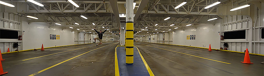
I'm surprised #4 didn't get any votes. Quite liked that one.
|
|
|
|
Post by Scott on Dec 3, 2006 22:40:36 GMT -8
The problem you get with, say a 5x2, is that for most people's screens, it would take up over 1/2 of the sceen space. Some people might not care I guess, but I don't think it looks as good.
|
|