|
|
Post by Hardy on Feb 17, 2008 16:09:30 GMT -8
I think we all know what this means - we have a new mission! To go and seek out the Provincial Coat of Arms aboard each major vessel left in service in the fleet ...  |
|
Ferryman
Voyager 
Posts: 7,475
Member is Online
|
Post by Ferryman on Feb 17, 2008 18:26:15 GMT -8
The Spirits still have their coat of arms. The C-Class all used to have coat of arms at one point, but were all removed. The Queen of Surrey actually was the last one to have the coat of arms out of the C-Class I believe. But I actually think the rest of the C-Class had theirs long gone before the 2003 privatization. This is the only photo I can find of the Queen of Surrey sporting the Coat of arms, pre privatization. But I still have newspaper clippings from her engine room fire back in 2003, as she was in the wavy blue scheme, yet still had the coat of arms. Anyways, you can just sort of see the coat of arms just below the forward lounge windows on the #1 end (#1 end is typically the bow) www.pbase.com/kstapleton/image/44605914 |
|
|
|
Post by Retrovision on Sept 3, 2008 8:23:52 GMT -8
I was near upset yesterday to see the bell of the Queen of Saanich replaced. 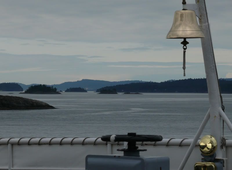 ...And by the looks of it the Queen of Vancouver's might have also been replaced. The deckhand through Active pass wondered aloud, said he'd try to find out about the change, though as I suspected the deckhand guiding the skywalk to the deck at Tsawwassen was almost belligerantly focussed on both it being "an old bell, heavily corroded" with the answer to my next question regarding a bell's prominence on a ship as "she's what, 46 years old?" and "she'll be sold next month anyways" I mean no ill will to BCF crews however, I just find it quite frankly shabby to replace such a so apparently "shabby" looking bell. |
|
|
|
Post by Barnacle on Sept 3, 2008 11:18:39 GMT -8
It's entirely possible that the original bells have been removed by BCF to keep them from strolling off prematurely.
It's also possible that said bells have already strolled off prematurely.
|
|
|
|
Post by Scott (Former Account) on Sept 3, 2008 11:21:03 GMT -8
It's entirely possible that the original bells have been removed by BCF to keep them from strolling off prematurely. Exactly the case. While they are spending their time off of their respective ships, they are getting refinished and polished and will be put back on the ships prior to their decomissioning ceremonies. |
|
|
|
Post by Retrovision on Sept 3, 2008 11:38:21 GMT -8
Myself and that first deckhand joked about just such as possibility and I immediately hoped it was the case that the company, under whatever guise, had done so.
|
|
|
|
Post by ferryfanyvr on Feb 21, 2009 18:12:17 GMT -8
|
|
Ferryman
Voyager
Posts: 7,475
Member is Online
|
Post by Ferryman on Feb 21, 2009 19:18:40 GMT -8
My goodness!  Thank you so much to anyone who has posted all of the pics in this thread! |
|
Mill Bay
Voyager
Long Suffering Bosun
Posts: 2,886 
|
Post by Mill Bay on Feb 21, 2009 22:25:12 GMT -8
Awesome only better,  . The Tsawwassen and New West definitely had the best looking welcome walls. The Queen of Victoria looks like she was only down to two decks at that point, cause i can only really see two stripes. I thought she had platforms similar to the Van, but perhaps they had been removed (or condemned by TC already). |
|
|
|
Post by WettCoast on Feb 21, 2009 22:45:25 GMT -8
Awesome only better, . The Tsawwassen and New West definitely had the best looking welcome walls. The Queen of Victoria looks like she was only down to two decks at that point, cause i can only really see two stripes. I thought she had platforms similar to the Van, but perhaps they had been removed (or condemned by TC already). I see a little wee bit of the third strip on the Q-Vic Welcome Aboard sign, though it is separated and below. I am impressed that 'ferryfanyvr' has line up these vessels in order - first the V-0's (Sidney class), the V-1's (Vic & Van), the V-2's (Esq. & Saan.) and finally the V-3's (aka B class). Well done and I hope he can add the Sidney to the collection. |
|
Mill Bay
Voyager
Long Suffering Bosun
Posts: 2,886
|
Post by Mill Bay on Feb 21, 2009 23:05:24 GMT -8
Awesome only better, . The Tsawwassen and New West definitely had the best looking welcome walls. The Queen of Victoria looks like she was only down to two decks at that point, cause i can only really see two stripes. I thought she had platforms similar to the Van, but perhaps they had been removed (or condemned by TC already). I see a little wee bit of the third strip on the Q-Vic Welcome Aboard sign, though it is separated and below. I am impressed that 'ferryfanyvr' has line up these vessels in order - first the V-0's (Sidney class), the V-1's (Vic & Van), the V-2's (Esq. & Saan.) and finally the V-3's (aka B class). Well done and I hope he can add the Sidney to the collection. I think that third stripe is actually only the hand rail on the stairway... I took a really close look at it. And, where did you get the designation of a V-dash-0 class? The Sidney and Tsawwassen were always their own class ;D. |
|
|
|
Post by WettCoast on Feb 21, 2009 23:21:32 GMT -8
You might be right about that lower strip actually being a hand rail. Hard to say for sure.
I have said it before and I will say it again. All BCF Spaulding design ships built in the late 50's and early 60s (9 ships plus the Q Richmond) are close enough in looks & character to be considered as one class. The prototypes were the Sidney & Tsawwassen (i.e. V-zero). The Vic & Van were a little different then the Esq & Saan hence V-1 for the former and V-2 for the latter. The so-called B class vessels, as built were all but identical to the V-2's, the only real difference being the funnel & funnel base. I do not consider the B's to be a separate class, hence the designation V-3.
On the other hand we consider the Alberni to be a C class even though it is profoundly different then its sisters.
|
|
Mill Bay
Voyager
Long Suffering Bosun
Posts: 2,886
|
Post by Mill Bay on Feb 22, 2009 0:04:52 GMT -8
You might be right about that lower strip actually being a hand rail. Hard to say for sure. I have said it before and I will say it again. All BCF Spaulding design ships built in the late 50's and early 60s (9 ships plus the Q Richmond) are close enough in looks & character to be considered as one class. I would say the differences between the Sidney class and the V's especially after stretching and definitely after lifting are significant enough that they can be categorized differently. Mechanically, and from an engineering standpoint, the V-Class differed considerably. The Sidney and Tsawwassen were merely a trial run, if anything, and a completed design from the beginning. When building the V's BCFerries literally rethought the whole design to better suit the needs of service. But the also made sure the shape for the V's wasn't fixed, leaving open the distinct possibility that the design could be changed or modified further. In a sense then, the design of the V's was left incomplete, but with the Sidney class, it likely would not have been possible to dramatically alter them because their design was already essentially fixed as it was and for all intents and purposes complete. Although there were some visual similarities, the differences between the ships were and are clear and obvious enough that they cannot be grouped together in a single category. Even their original shapes were different enough to preclude such a unified category. In addition, the question has often come to mind... with each successive rebuild, the design of the ships was changed by the addition of sponsons, new house structures, raised funnels, etc, so are they really the same ships that Spaulding designed anyway? Spaulding designed the Sidney class and the V's the way they were originally. When they rebuilt and stretched the V's, they changed the design; they no longer followed the same plans or pattern, so are they really the ships Spaulding designed, or are they now the ships BCFerries designed because even in appearance they are not what Spaulding designed... he did not design them as stretched or lifted, he designed them as they were built. I just find it intriguing to think that for ships like the V's, and now the New West, you logically think of them as having been, at some point, three different ships, maybe all bearing the same name, but still at three different stages, the ship was changed to the degree that it could even be considered a completely different wholly distinct from the previous one. |
|
Quatchi
Voyager
Engineering Officer - CCG
Posts: 930
|
Post by Quatchi on Feb 22, 2009 1:40:36 GMT -8
OOOHHH baby, old pictures of the Chilliwack. SWEET. If you have any more please post them, older pictures are so hard to find of the Wack.
Mill Bay,
I would consider the V's and the Sidney/TSA the same class, yet not identical. It all depends on what you consider the limits of a class. I would say that the V's and Sidney/TSA were of one class, the C's and Super C's of another. I would consider a class to define major size and operation characteristics. Now, obviously changes over the lifespan of the vessels have changed their appearance, functionality, and operational quirks of the V's so as they no longer are anywhere near that of the original two, BUT they were built to the same basic design principals as the Sidney/TSA. The hullforms, superstructure, basic structural layout and operational standards just made them Super Sidney/TSA. They are at heart based of the same design, they are very similar. They aren't identical twins, but more like sisters, each has its own personality and appearance yet you can tell they are of the same family. This topic is although based on personal opinion.
Know your comment to the V's no longer being Spaulding designed ships I must disagree with on a professional level. When someone designs a ship or a building and they do all the planning, design, engineering, testing, or whatever is required to finish the project and deliver; that ship/building design will remain the sole credit to the original designer, the design is not so much every little peice of metal and every bolt, but it is the general theme or look and feel of the vessel.
BCF made changes to the vessels to keep up with demand, they DID NOT design new ships. If the vessels were to no longer be of Spaulding design they would have to rip out the bridge, funnels, stern, bow, the chine, etc. in other words they would have to tear the ship completely apart and assemble the parts back in a fashion that people who are quite familiar with the vessel would not be able to recognize the vessel at all. These aspects of the ship are what make its design, not necessarily how long they are, or how many decks it has. Even thought these ships have been hacked apart numerous times, they are still of the SAME design they started with.
As Architects, we can usually point out another Architects work from the first glance, of course I cant yet, but my bosses could. The same applies to the ships, I am pretty sure a lot of Marine Architects could look at these vessels and say "Spaulding" designed that one.
I'm sorry to be so stern about this, but protecting ones design is a very large problem in my field of work, and I'm sure it is in the marine world as well. A famous architectural quote goes as follows:
Every Poem has a Poet
Every Novel has a Writer
Every Invention has an Inventor
Every Shoe has a Designer
Every Building has an Architect
Cheers,
|
|
|
|
Post by Northern Exploration on Feb 22, 2009 8:04:28 GMT -8
The hullforms on all the vessels were the same. The deckhouses changed the most after the Sidney and Tswwassen, with the deckhouse beginning further forward toward the bow. Modifications were done that incorporated the inservice feedback by the crews and intended routes. So from the Coho to the Burnaby/Nanaimo there is quite an evolution.
How many modifications can be done to a series of vessels until they can be called a new class is not a black and white issue. I think it is is grey at best. They usually are substantial it seems. The term "Improved" is often added. IE. The Improved Virginia Class.
Airliners that are more mass produced often have a model (737) and then as it is modified versions are produced 737-100, 737-200 etc. Even within a 737-200 there can be various engines, interior fittings are different, floorplans can have minor variances, and avionics can vary. The manufacturers indicate which airline version the aircraft is by the changing of two digits. B737-133 for example. A 737-100 varies massively from the 737-900.
As far as who designed the vessels. A naval architect would have to have done the drawings for both the stretches and the lifts. As well drawings would have to have been done for the upper restaurant modifications in between. Does anyone know if they were done by Spaulding or his office? Either way the additions were done to fit within the original Spaulding design. The stretch was very sympathetic. The gaping mouth added in the lift was the most visually different but still didn't massively makeover the rest of the ferry.
I guess this is something that can be debated back and forth. Maybe Herr Brinkmann can comment if he knows what the "standards" or commonly accepted standards are for a "class". His opinion would be interesting.
|
|
|
|
Post by Low Light Mike on Feb 22, 2009 9:49:28 GMT -8
Although there were some visual similarities, the differences between the ships were and are clear and obvious enough that they cannot be grouped together in a single category. My counter points are that: 1) The fact that each of the 7 sisters (plus the 'Richmond) were originally Spaulding designs is a legitimate common-thread which permits a common grouping. For me, this grouping is commonly known as the "7 Sisters". Within that, there are numerous ways to break down the 7 into sub-categories, limited by someone's zoom. 2) People can and should be able to group objects together in categories/classes that make sense to themselves. A look around this forum is proof enough that people think differently from each other, and so it makes sense that category groupings stay subjective. As much as we'd like to think so, there is no authoritative end-all categorization of things. Even ships' owners make seemingly illogical choices in their own groupings. I enjoy reading all (or most ;D) people's reasonings for how they see things. Understanding someone's point-of-view doesn't mean I have to agree with it though. Well articulated reasonings should be respected. |
|
|
|
Post by ferryfanyvr on Feb 22, 2009 11:01:53 GMT -8
Awesome only better, . The Tsawwassen and New West definitely had the best looking welcome walls. The Queen of Victoria looks like she was only down to two decks at that point, cause i can only really see two stripes. I thought she had platforms similar to the Van, but perhaps they had been removed (or condemned by TC already). Yes, that "3rd stripe" on the Victoria's bulkhead is, in fact, the top of the handrail. And the Victoria was never equipped with platform decks. When designs were drawn up, both the Vic and the Van were to have platforms. They ran out of time to install them before the summer 1981 season, so the Van received them the following autumn, but the poor Victoria was never retrofitted. |
|
Mill Bay
Voyager
Long Suffering Bosun
Posts: 2,886
|
Post by Mill Bay on Feb 22, 2009 20:25:52 GMT -8
Every Poem has a Poet Every Novel has a Writer Every Invention has an Inventor Every Shoe has a Designer Every Building has an Architect Cheers, I wasn't trying to start a row, not that anyone is tearing each other's eyes out either. I was just playing around with idiomatics... if you don't know what that is, look it up, but the particular definition I have in mind is: a mode of expression having a distinct style or character, esp. in the arts. I was just trying to see how many divergent meanings I could pull out of the notion of design. I was just trying to hit at the notion that it might be possible to alter someone's design enough that it is no longer theirs. But, as an author I fully understand the significance the notion of design has to the designer, and there are more than a few of us who can tell one of Spaulding's designs without being marine architects. If only the ferries themselves could talk, though... imagine what they might say about what all this redesigning does for their personalities. |
|
|
|
Post by Northern Exploration on Feb 23, 2009 10:25:56 GMT -8
Every Poem has a Poet Every Novel has a Writer Every Invention has an Inventor Every Shoe has a Designer Every Building has an Architect Cheers, I wasn't trying to start a row, not that anyone is tearing each other's eyes out either. I was just playing around with idiomatics... if you don't know what that is, look it up, but the particular definition I have in mind is: a mode of expression having a distinct style or character, esp. in the arts. I was just trying to see how many divergent meanings I could pull out of the notion of design. I was just trying to hit at the notion that it might be possible to alter someone's design enough that it is no longer theirs. But, as an author I fully understand the significance the notion of design has to the designer, and there are more than a few of us who can tell one of Spaulding's designs without being marine architects. If only the ferries themselves could talk, though... imagine what they might say about what all this redesigning does for their personalities. Your point is well taken Notorious (sounds like a rapper  ). An example outside of marine architecture is the redesign of any iconic building. Seldom does it keep everyone happy. The redesign of the AGO (Art Gallery of Ontario) is one. Frank Gehry has received accolades for it. However, the former designer refuses to visit it. Not only that there was a furor when a prominent donor and board member stormed out of a meeting and resigned at an early design stage. Joey Tannenbaum had been involved with the design of the gallery with the previous designer, not surprizingly called the Tannenbaum Scupture Atrium, and donated a large wack of money to fund and name it. Typical for large donors he had a fair bit of ownership over it. Along comes Gehry with his redesign that called for some dramatic changes to the space. He had been given compete freedom with the exception of the Frank Moore Gallery and historic elements such as the The Grange historic building. Eventually Gehry met with Tannenbaum and since he isn't a primadonna designer came up with some compromises. I think the space before was nice but a bit cold and cavernous (great for hosting events) and a bit wasted as the restaurant took up a third of of it. The gallery now is still modern and impressive but much more vibrant and warm with the Gehry touches like the overhanging staircase. The shipping/marine world is much more practically orientated and often needs outweigh esthetic design considerations. The late John Bannenberg was an iconic designer and he did some very distinctive designs - particularly in yachts that people either loved or hated. The first person to do a reworking of one of his designs will likely incurr the wrath of many who are Bannenberg fans. Bannenburg took on a reworking of the famous classic yacht, Rosenkavalier. He did a very sympathetic job and in order to add a larger generator added an additional funnel to house it. If you are interested google it and its current name Talitha G. Back to ferries I will limit my comment so not to impinge on the Sisters thread but I thought the stretching was sympathetic to the original and the lifting less so. But like you have said it is just opinion and lots, particularly those who grew up with the lifted ferries, will disagree with me. |
|
|
|
Post by coastalgirls on Jan 14, 2010 17:47:09 GMT -8
Nothing was better then the old dogwood flag (we do not need a new take on it) and the baby blue on the boats. As a child I thought the blue matched the water and my parents taught us about the dogwood being OUR flower and about the queen who's picture was always in sight. Simple !!!! For me and for many people I have spoken with (23 years working with the public) B.C Ferries did not need to be changed. They represented SAFTY, Reliability, and polite service. This was B.C. Our old colours and dogwood along with all it represents is somthing our B.C. Ferries could use. Especially Now! My vote is to save money on an advertising agency. If it was not broken dont fix it.... just put it back on and appreciate all the emotional branding that it already contains. Linda P. Attachments:
|
|
Neil
Voyager
Posts: 7,189
|
Post by Neil on Jan 14, 2010 19:22:26 GMT -8
This particular horse bolted out the barn door looooong ago. The old logos were for the government enterprise, the wave is for the 'private' one.
The public doesn't seem too bent out of shape at not seeing dogwoods on the carpets anymore, so I guess ferry fans may as well adapt too.
|
|
|
|
Post by lmtengs on Jan 15, 2010 6:39:19 GMT -8
I agree with you, CoastalGirl. Even though I'm not old enough to have experience the old pastel blue scheme, I've obviously seen many photos, and if I had the choice, I'd make BCFS change the logo and paint scheme back to the original, that most everyone seems to love more than the "mating slugs", as we call the new logo
|
|
|
|
Post by WettCoast on Jan 15, 2010 19:37:32 GMT -8
As regulars here know, I am not a big fan of the current BCFS paint scheme, or for that matter, the 'Slugs'. It would be fantastic to see a return to a 'classic BCF' scheme, whether it be pastel blue or Expo. I am not holding my breath with any expectation that such will actually happen soon. When BC voters finally send Gordon Campbell packing, Davin Hahn will be gone soon after. Only then might we see a return to ferries that look good, and a house flag that actually has some history and meaning.  Once upon a time our ferries looked superb... Once upon a time our ferries looked superb... |
|
|
|
Post by lmtengs on Jan 15, 2010 21:31:15 GMT -8
As regulars here know, I am not a big fan of the current BCFS paint scheme, or for that matter, the 'Slugs'. Is anyone?? Even BCF's expo Blue isn't the actual EXPO 86 colour, but whatever. I would definitely prefer the pastel blue.Even if BCF only did do it as a little tribute, on two or three select older ferries like the Queen of New West, Oak Bay, and Bowen for a limited time, say 5 years, I'd be absolutely thrilled. I choose the above ferries because: *New West: I've always thought of her as the pastel lady. *Oak Bay: We need one for each mega-major route. *Bowen Queen: We need at least one minor vessel with the original paint scheme too. |
|
|
|
Post by coastalgirls on Jan 17, 2010 19:06:02 GMT -8
Wet Coast, the picture is great of the old baby blue and dogwood. Brings back childhood memorries from the 70's and as a child how I thought the baby blue looked so good on the water.
I want to reply to the comment that the public does not seem to be bent out of shape not to see dogwoods on the carpet...
I am not a ferry fan just a person who, like so many, grew up with the B.C ferries. I speak for ALOT of people both old and mid life like myself, who I have talked to while working in a grocery store for 23 years. Those who traveled the Ferries loved the baby blue and the dogwood, they want it back along with the service and safty it represented. A great connection with our amazing province history can be passed onto the next generation. I thought the new corporate logo looked like the love boat from way back and very American. It also did not compare at all to the baby blue and dogwood.
Viking thank you for the suggestions. I am new on this site and after speaking to yet again another person with this view, I thought I would find a place to voice it.
I would like the new horses in the barn with the old saddle and bridle back on again.
Thank you,
Linda P.
|
|


 . The Tsawwassen and New West definitely had the best looking welcome walls. The Queen of Victoria looks like she was only down to two decks at that point, cause i can only really see two stripes. I thought she had platforms similar to the Van, but perhaps they had been removed (or condemned by TC already).


 ).
).